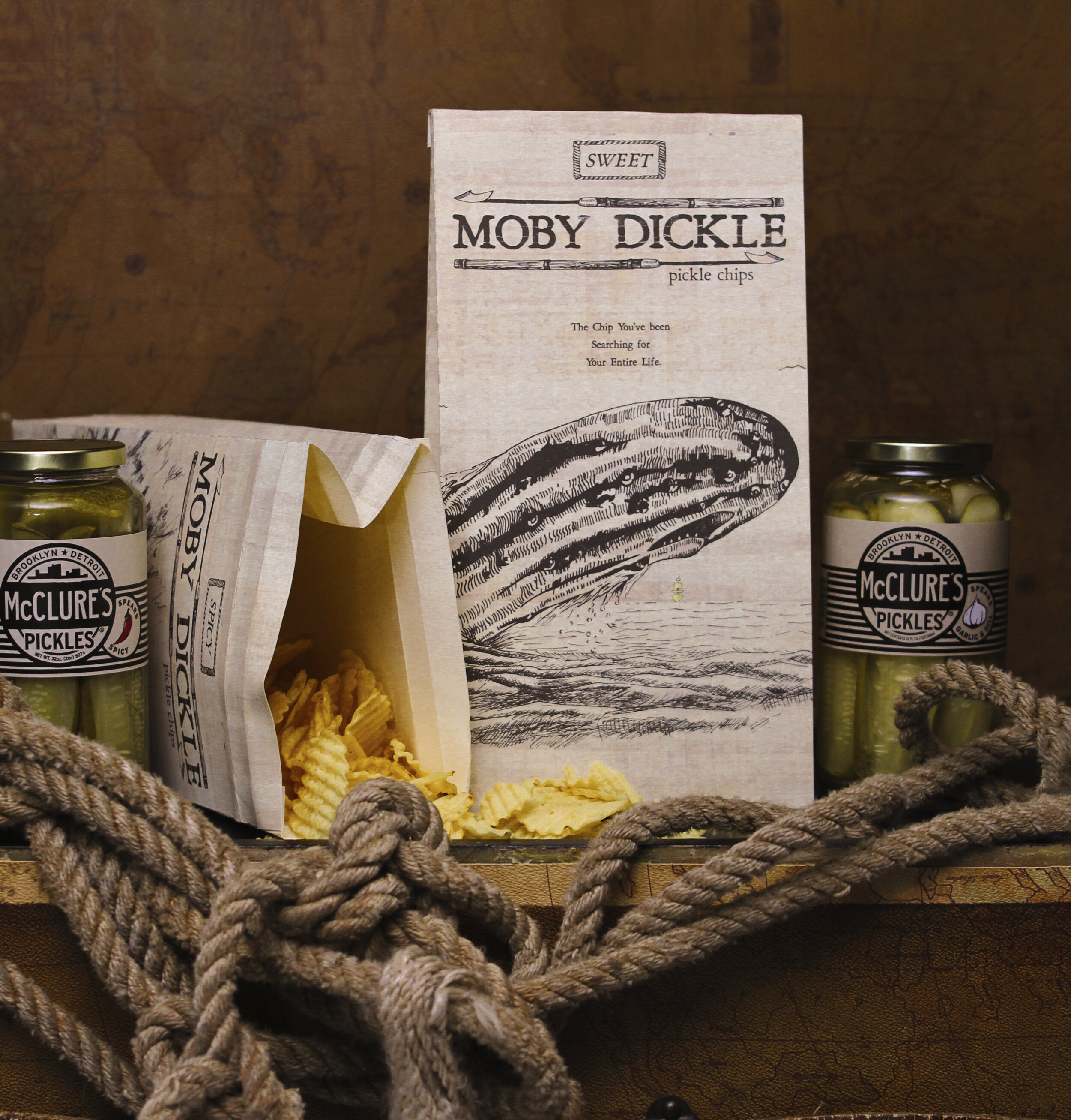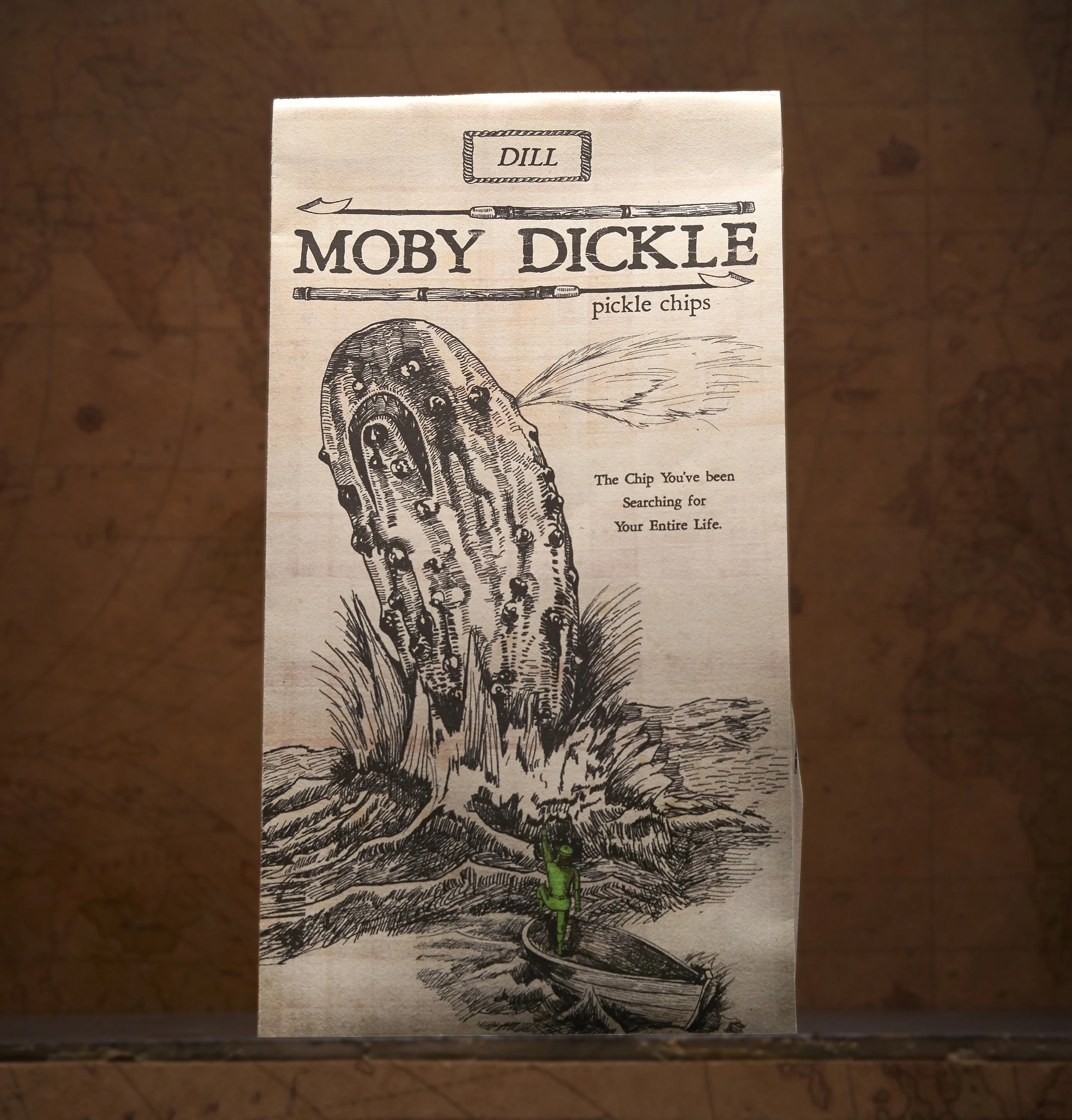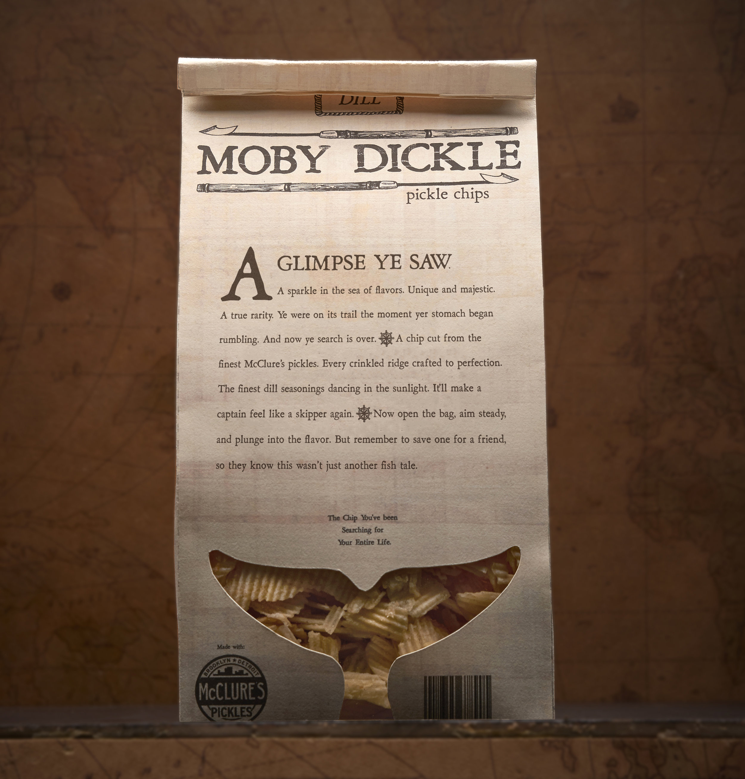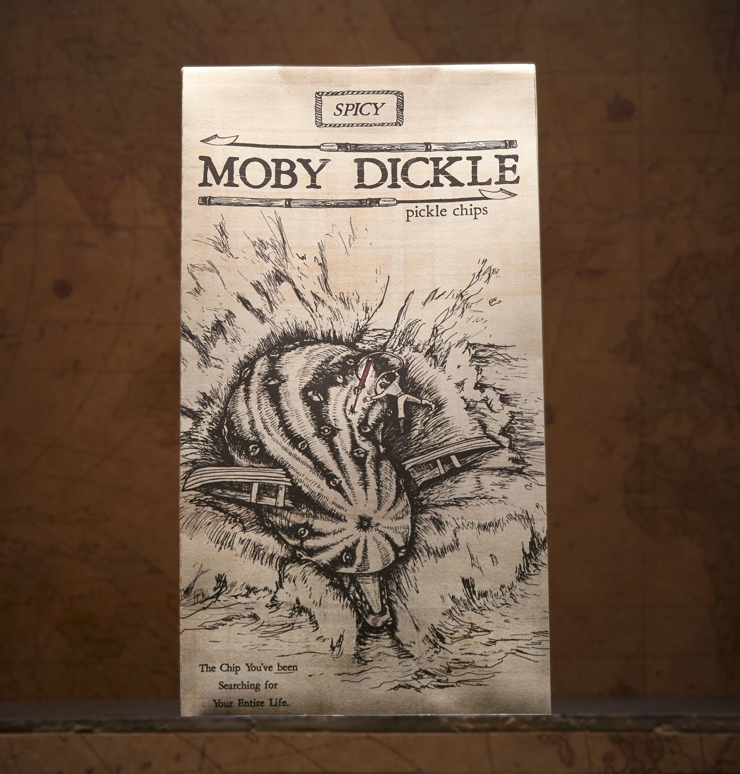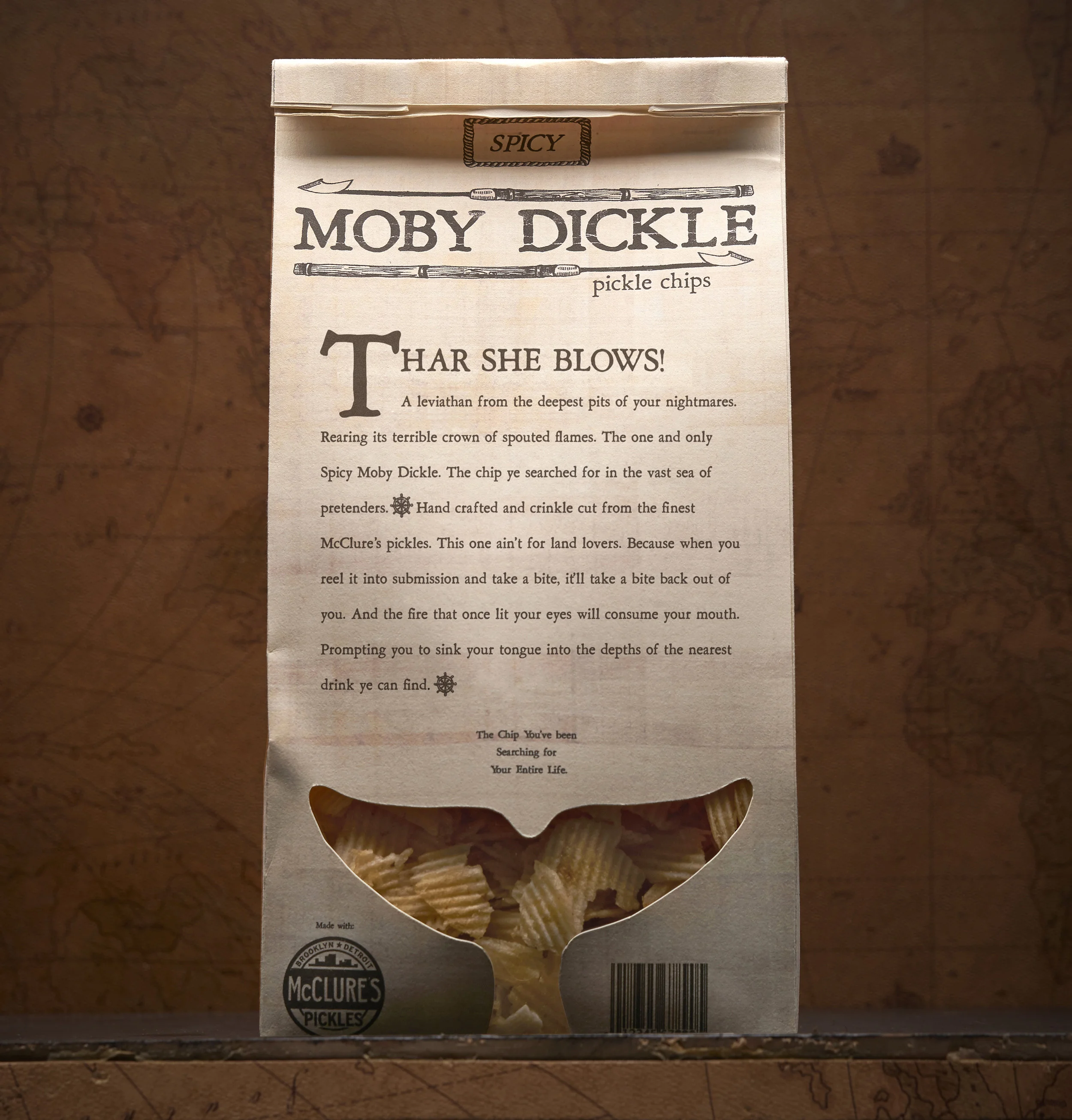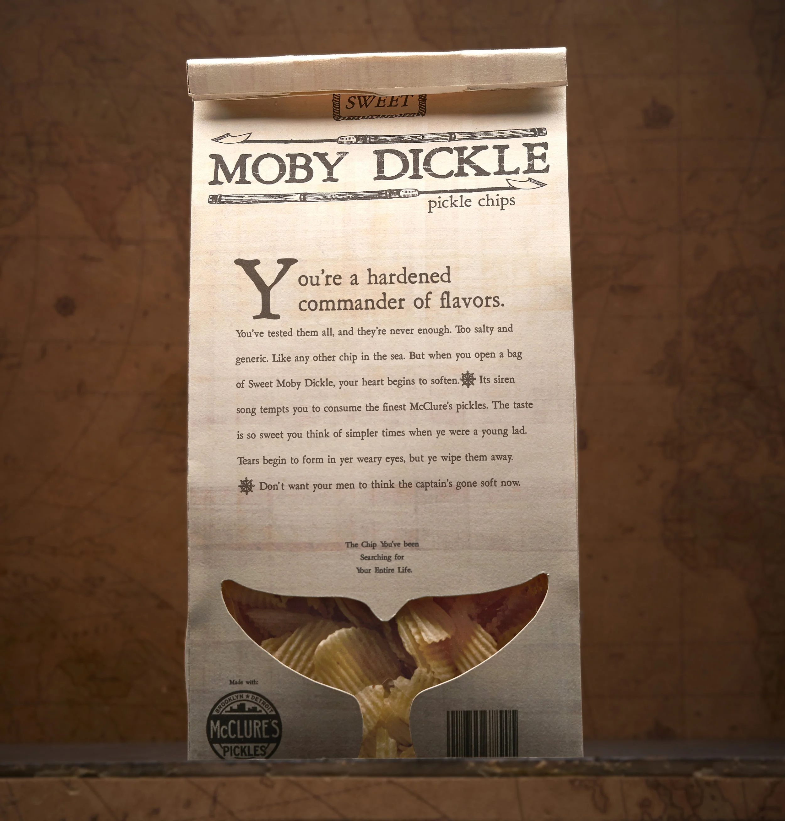
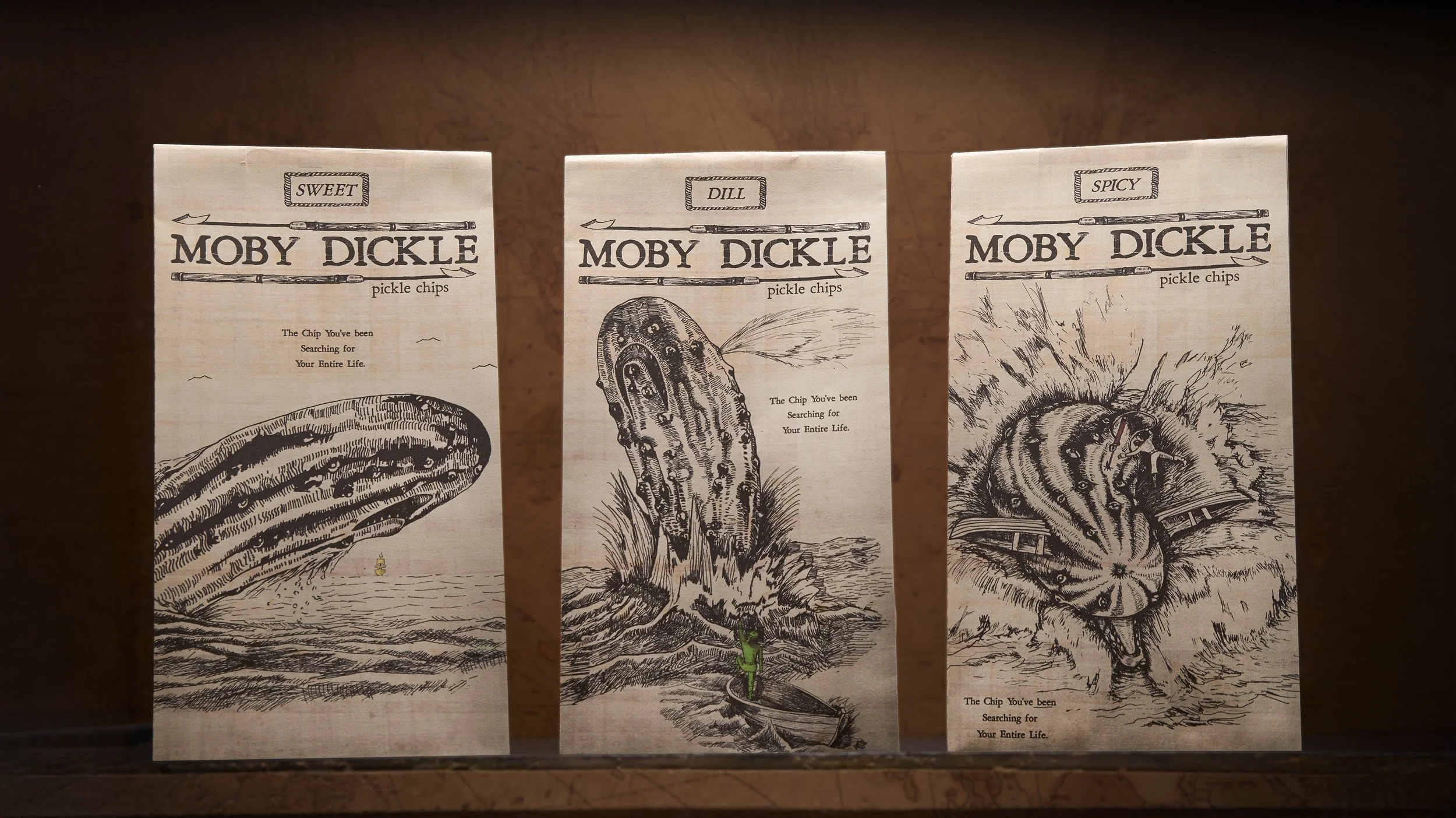
Moby Dickle Pickle Chips:
This is packaging for a start up chip company that partnered with McClure's Pickles to create a dill flavored potato chip unlike any other.
Challenge:
Create packaging that :
1. Stood out from their competition's packaging. i.e Lays.
2. Attracted their target market, 18+ men and women who shop at higher end grocery stores like Whole Foods, the Fresh Market, and Trader Joes.
Strategy:
These challenges were met in 3 ways:
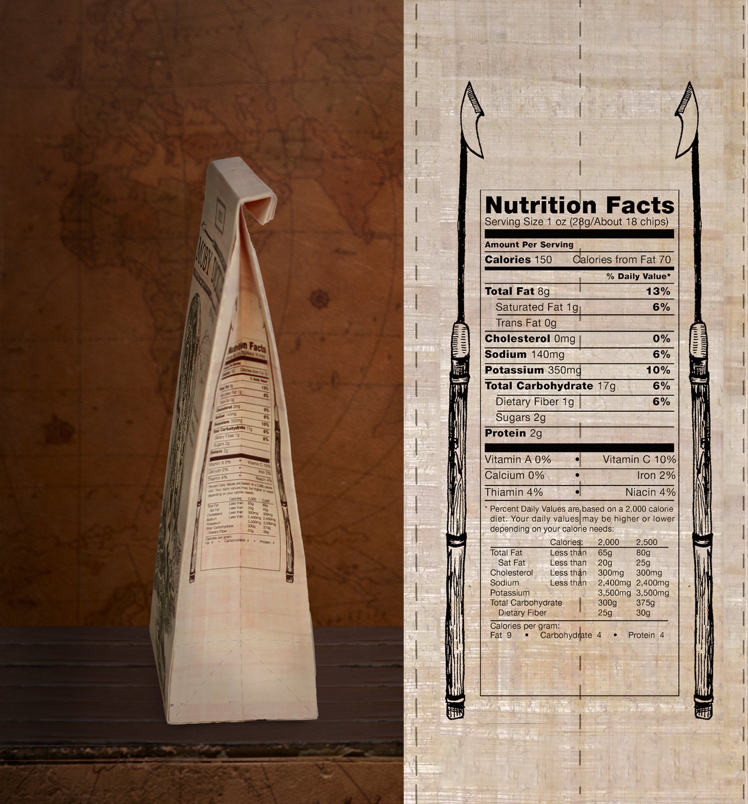
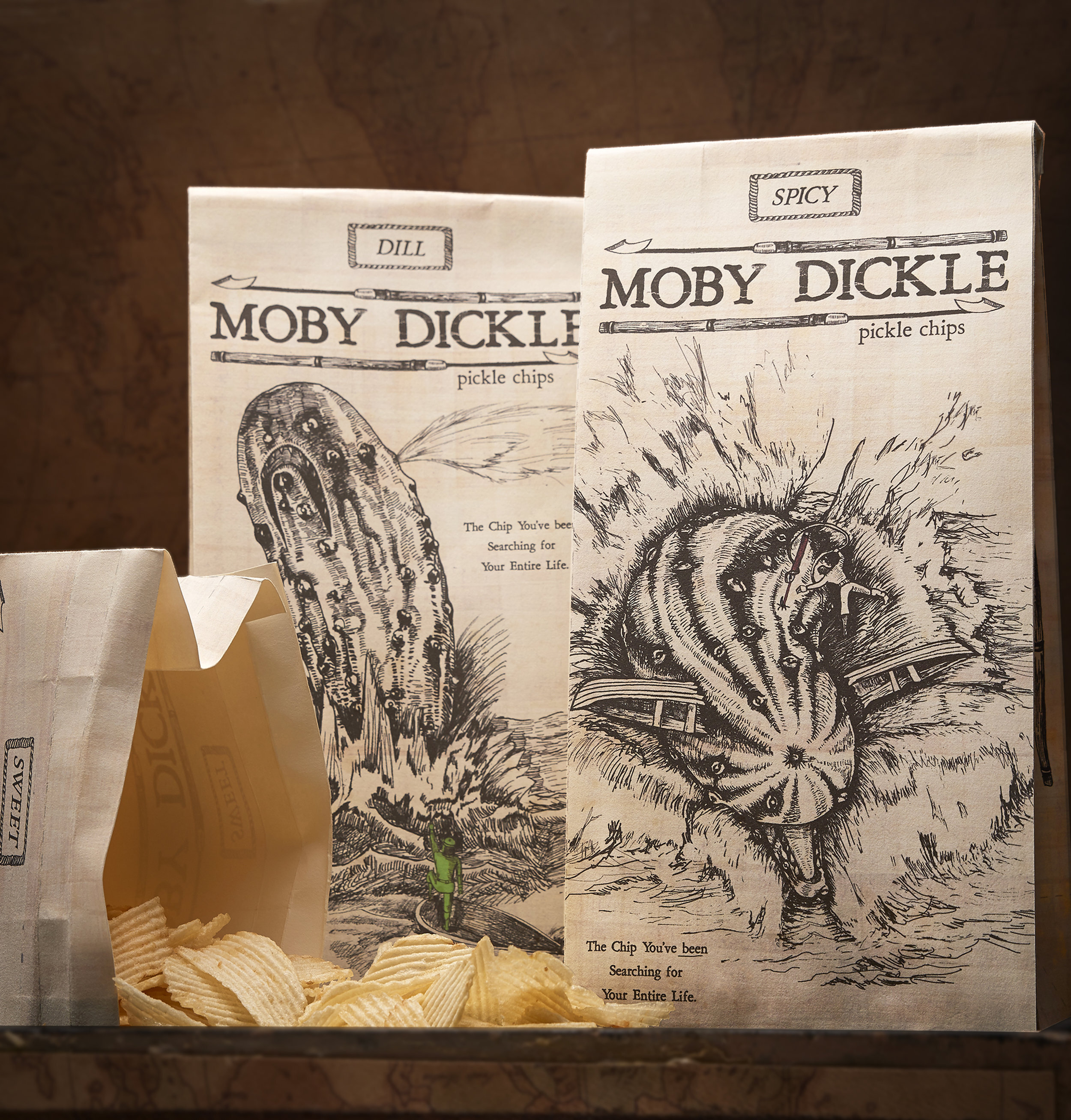
1. The shape and design of the bag. its taller, skinnier, and sleeker than your average lay's bag of chips. It has a die cut on the back that shows the consumer what they are buying, unlike the usual photograph that doesn't depict the chip honestly.
2. The paper used. its rives bfk paper. Its heavier, has a deep tooth texture, and doesn't make that horrible chip-bag sound when opening it.
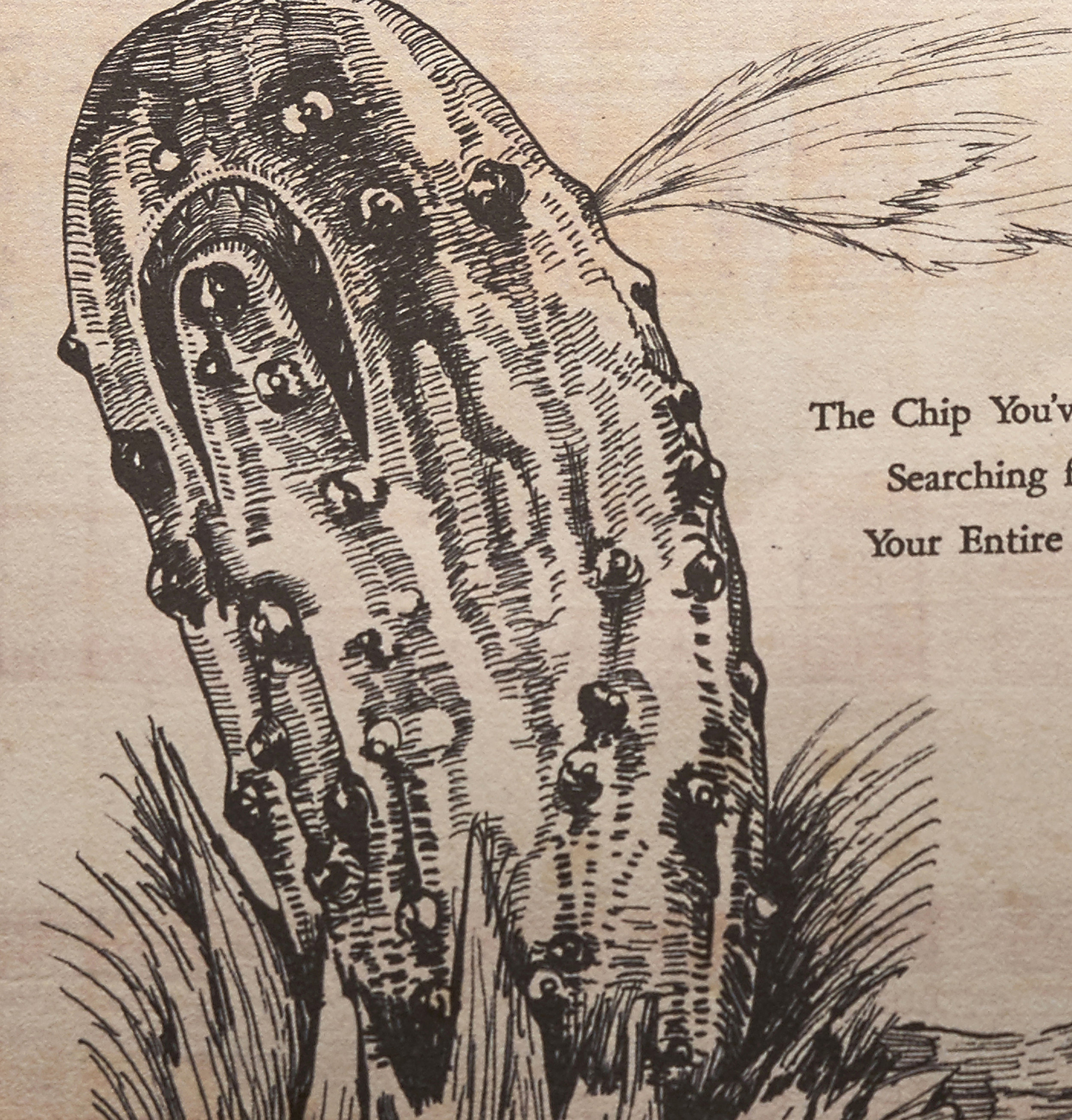
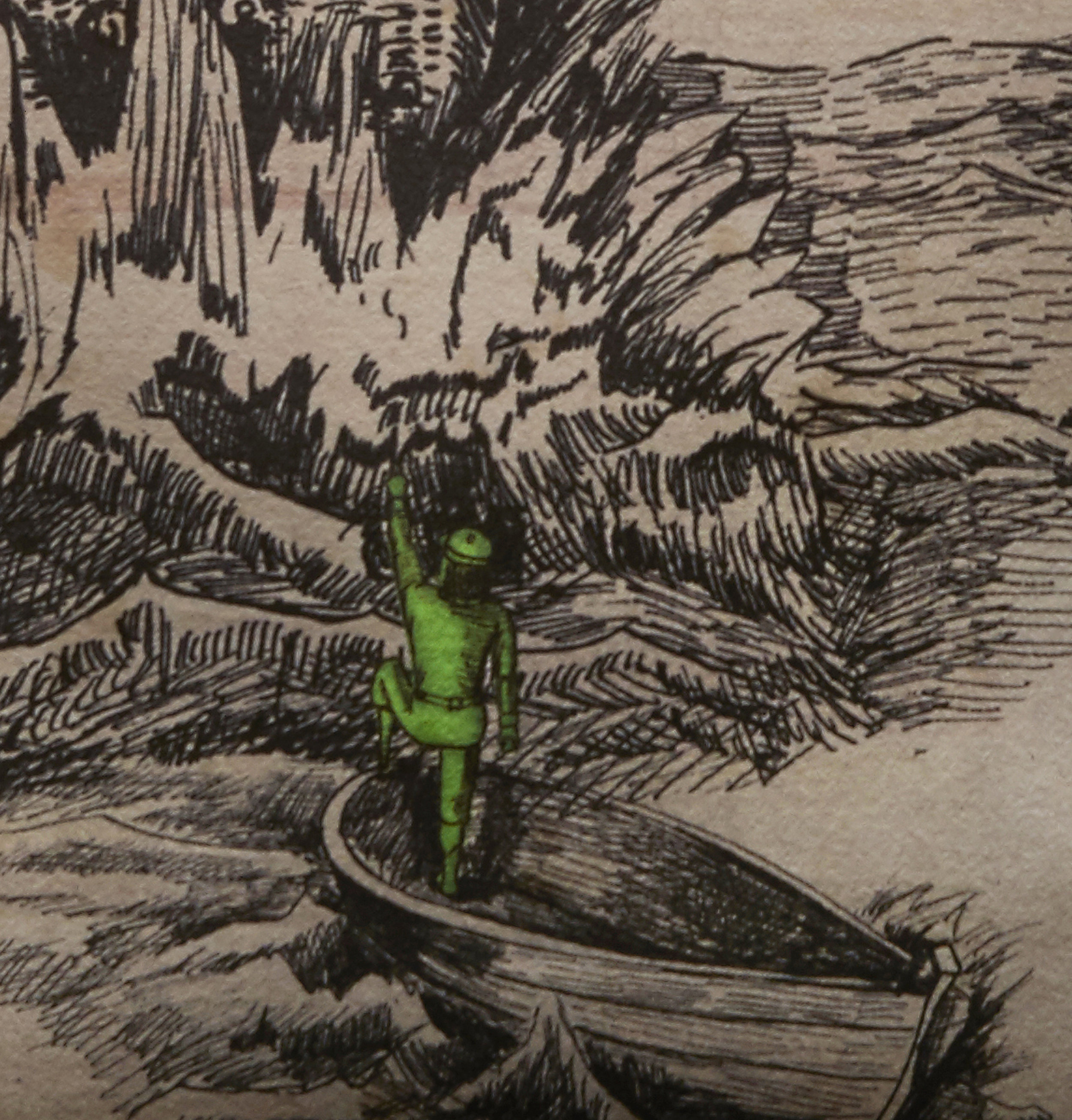
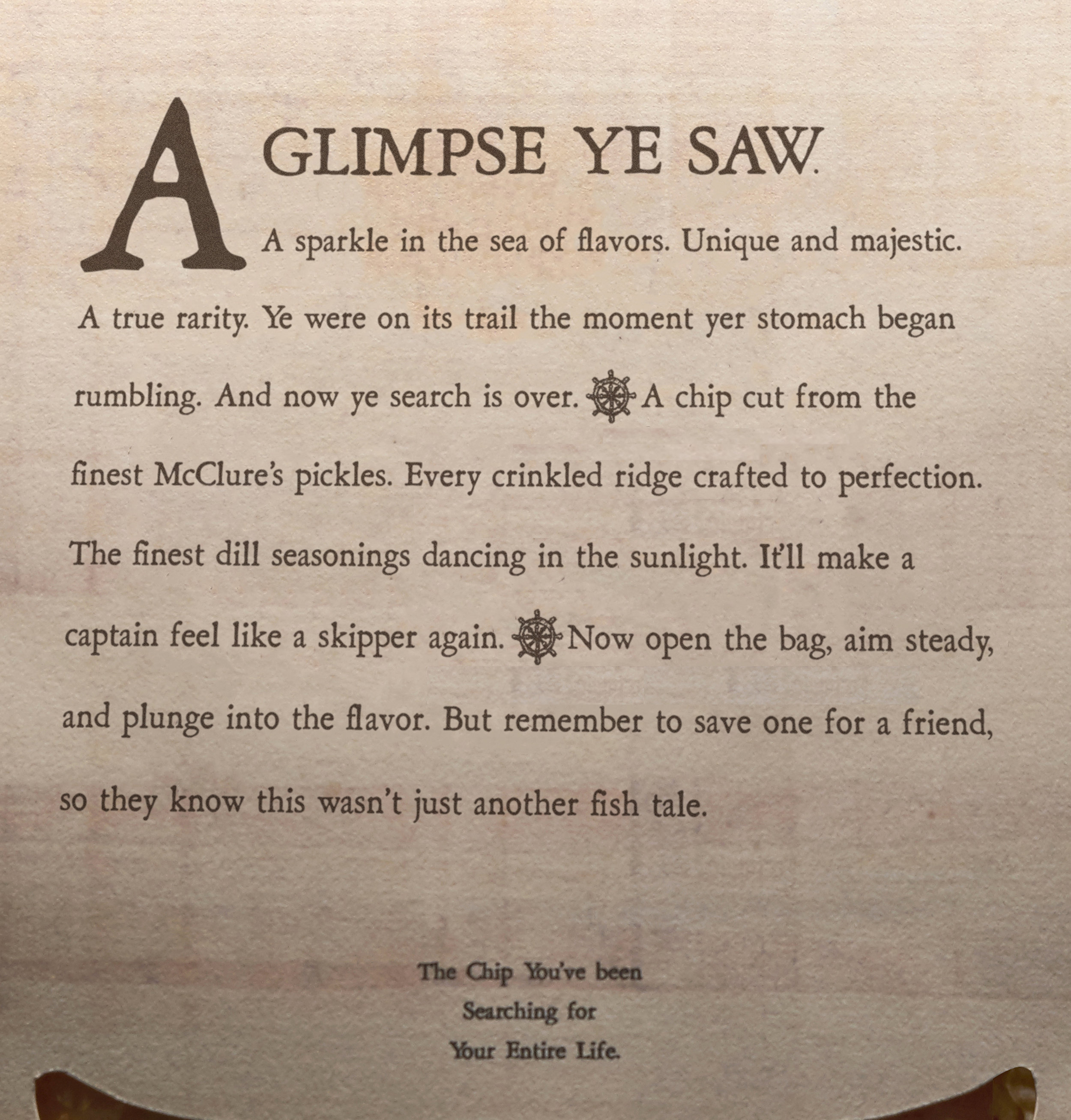
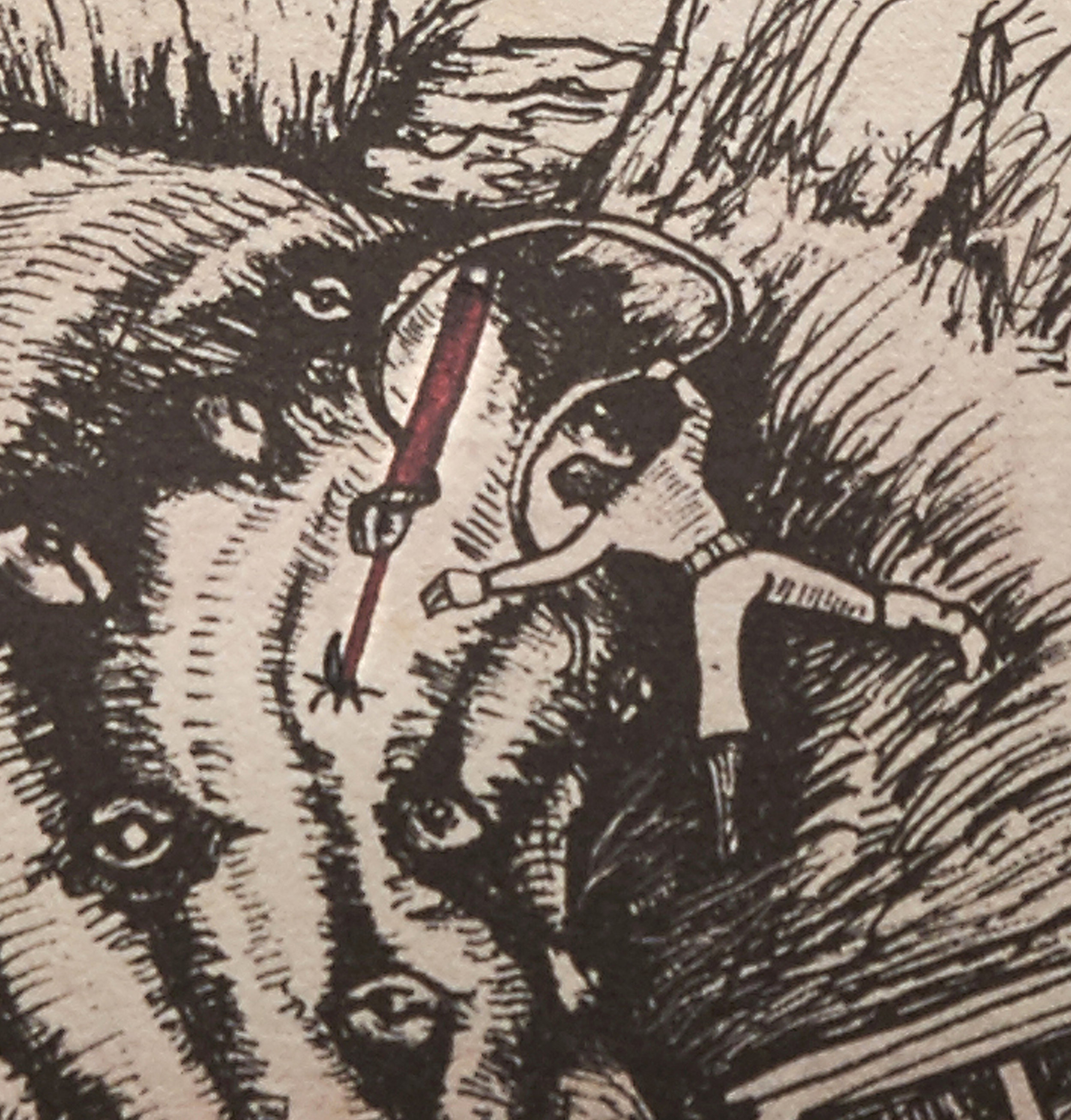
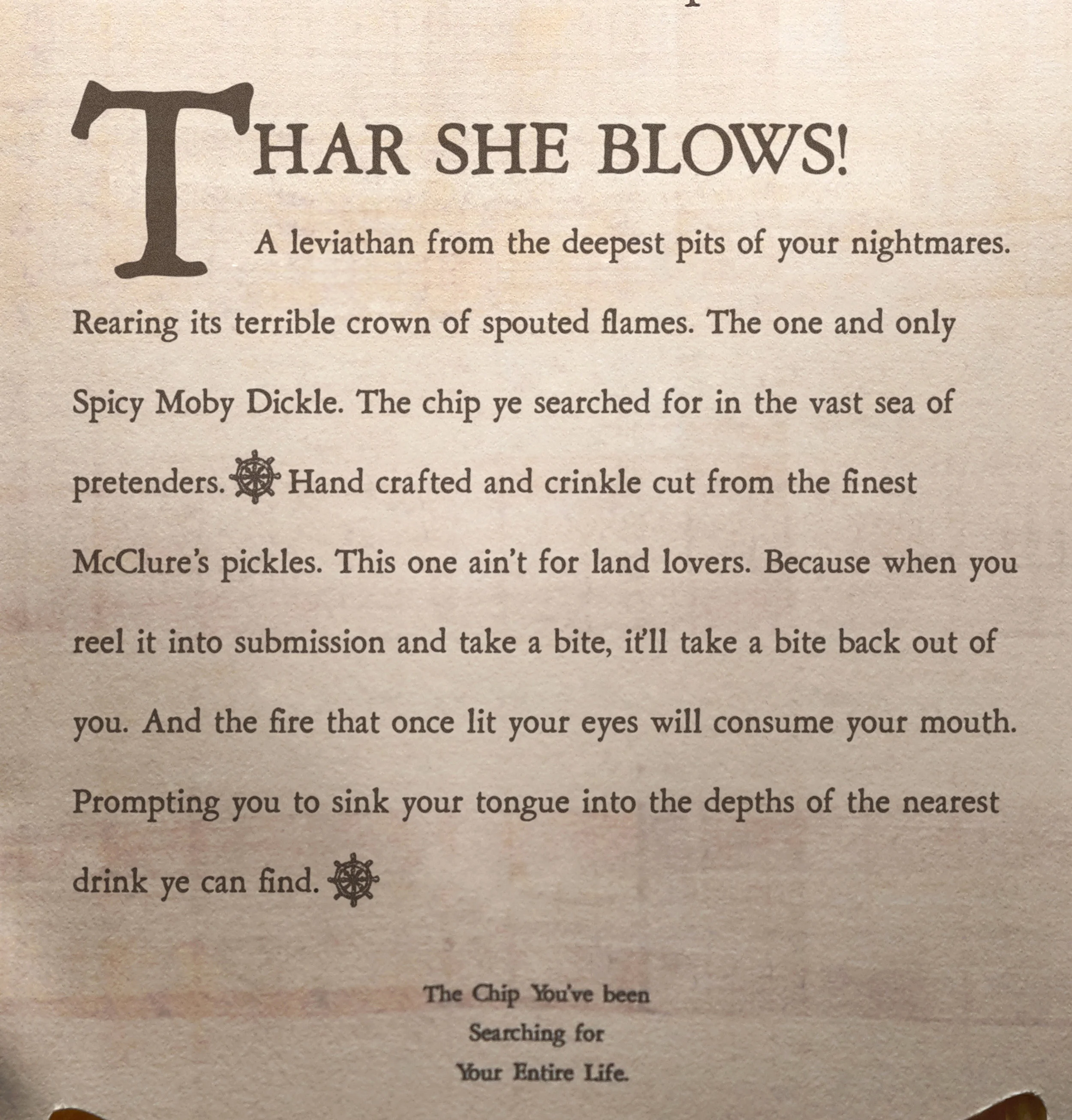
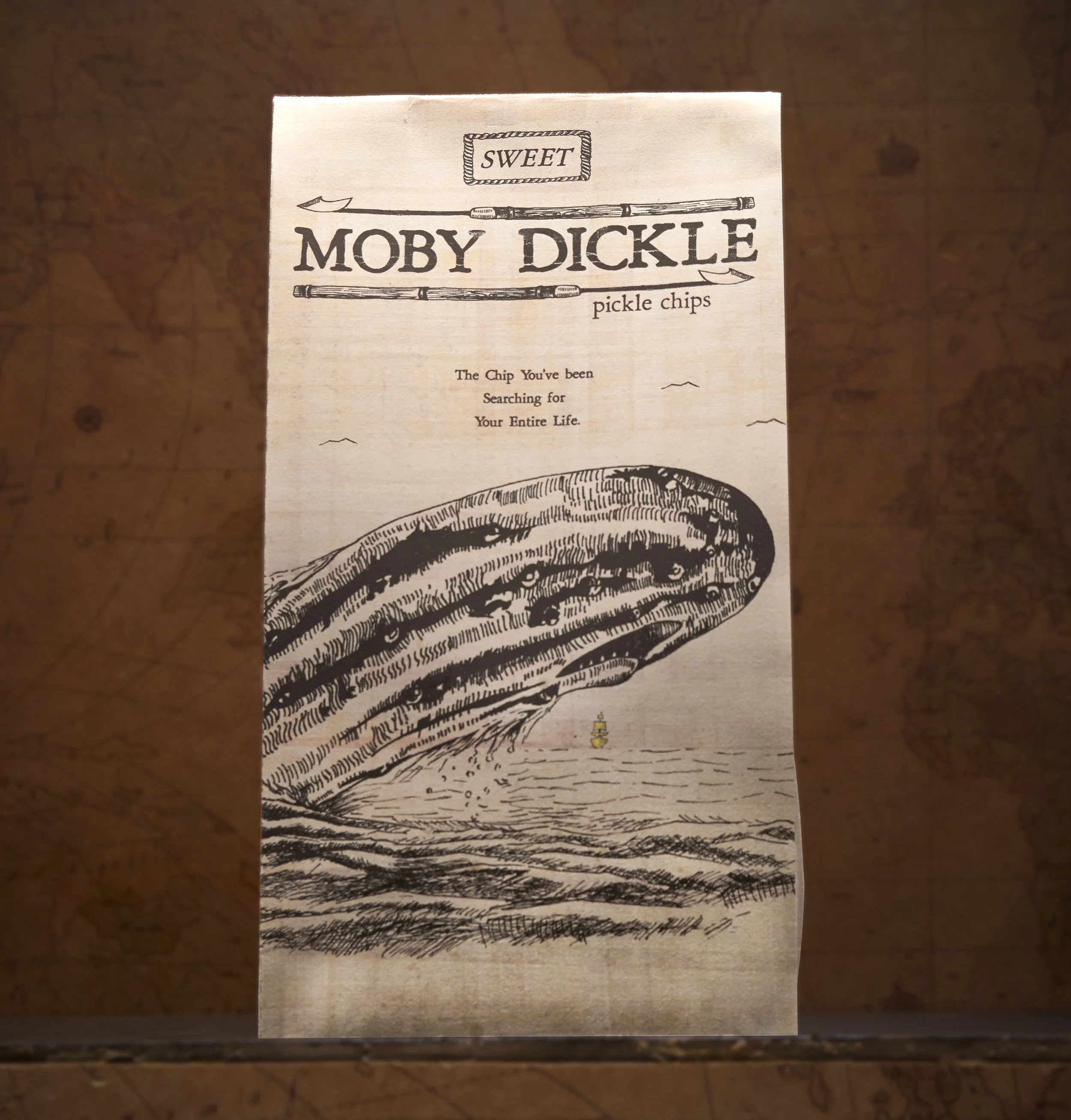
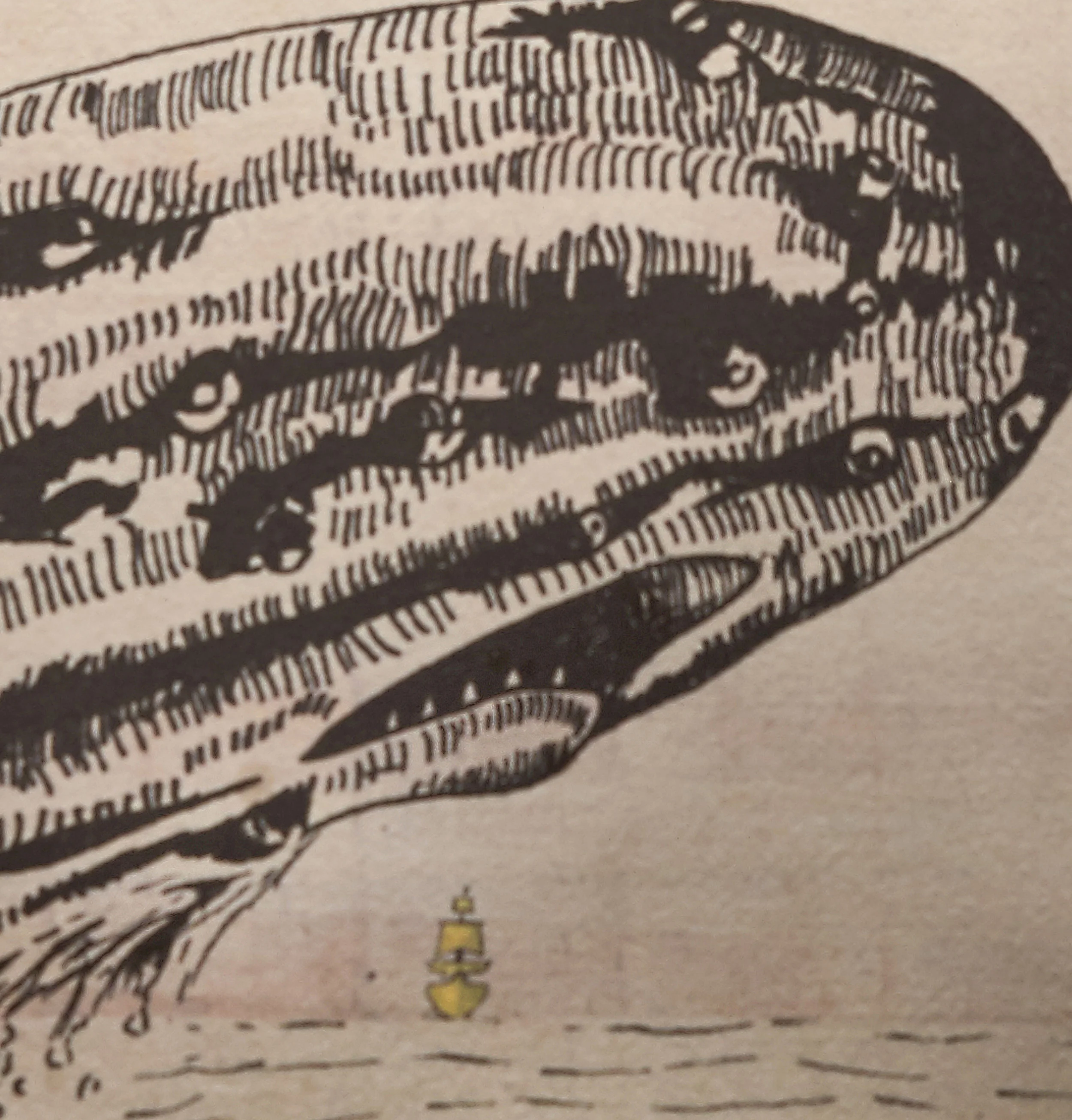
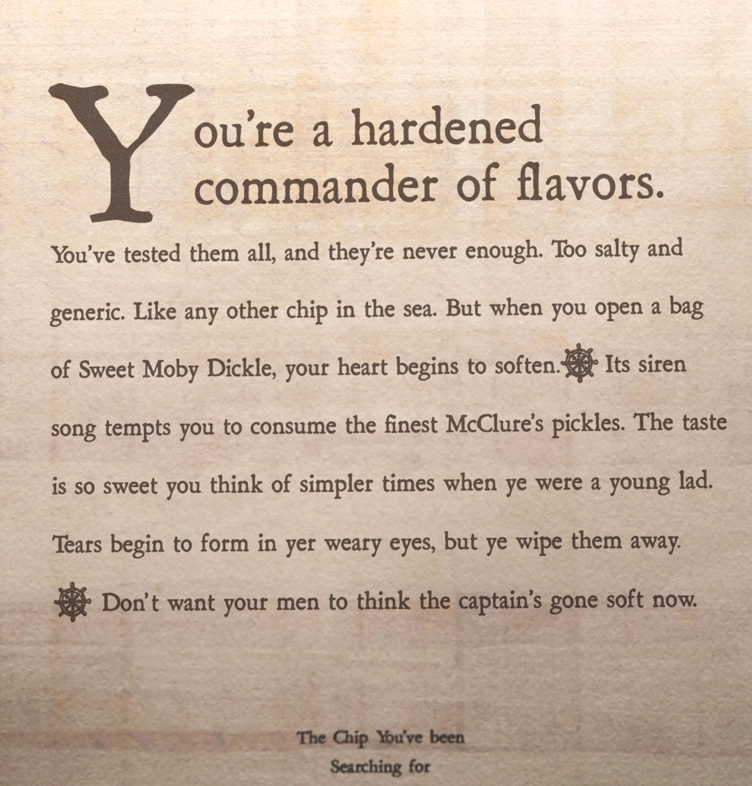
3. The hand done illustrations coupled with the distressed type. The illustrations are done in classic pen & ink style that adds a touch of class to the packaging. The typeface pairs with the illustrations to combine for a classy yet rustic overall product.
My overall goal was for the consumer to feel like they weren't just buying a bag of chips, they were buying a piece of art.
silver: creative circus student show
Copywriter: Dan Lemaux
Photographer: Pat Hart